Kitchen Update on a Budget
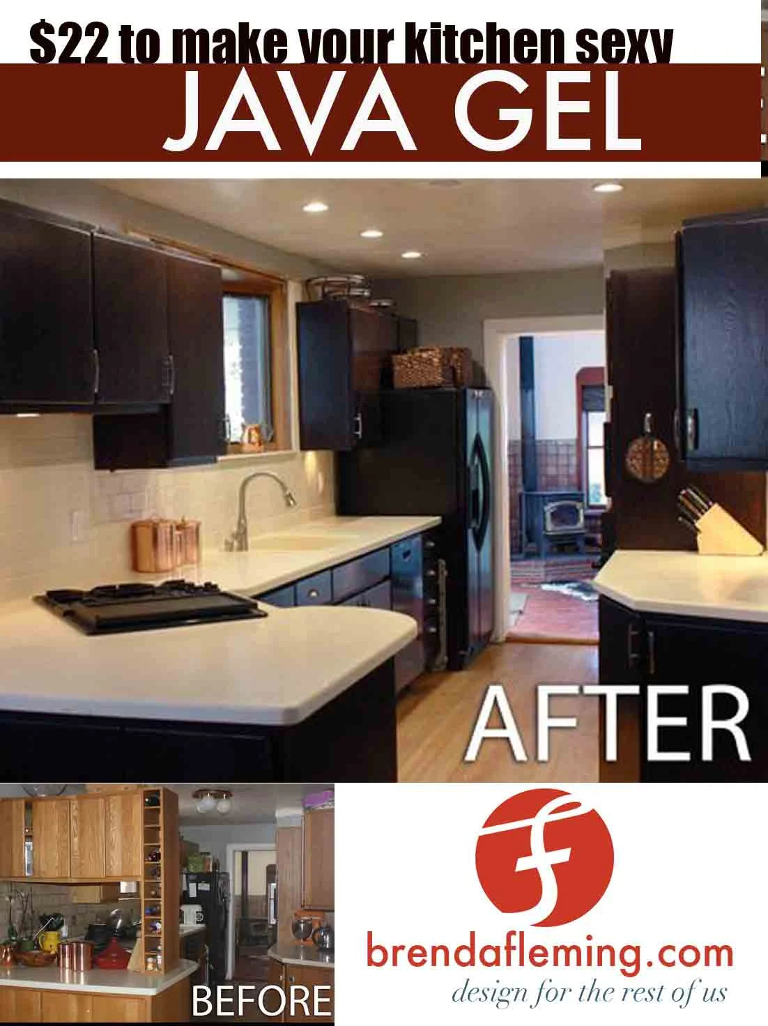
We drastically updated our kitchen without replacing any appliances, counter tops or cabinets, hence, it was pretty affordable!
Here is what we did:
- stained the kitchen cabinets to a dark, stunning espresso color using General Finishes Java Gel
- added stainless steel bling (faucet and hardware). The faucet was an (awesome!) gift from Ian's parents - thanks John and Lydia!
- upgraded the lighting to recessed LED lights (seven total, our kitchen is SO bright now!)
- upgraded back splash to almond subway tile (EXACT same color as counters) and bone colored grout
- took out overhanging cabinets that blocked the dining room
- put an orbital chandelier over the table in the dining room
- refinished our Avonite countertops (this solid surface can just be sanded down to remove any scratches/dents)
What did we learn about interior design? KEEP IT NEUTRAL!
Initially I wanted a colorful glass black splash and funky pendant lighting - but thanks to my sister who is an amazing designer, we kept it all VERY neutral. Why? Because A) you can always have fun with accent colors, e.g., copper canisters or bright orange KitchenAid, and B) it makes our kitchen feel relaxing, like the inside of Starbucks.
Find a Reference Picture of Your Dream Kitchen.
When designing your kitchen, find a picture of a kitchen you love, and use it as a reference. Or a cafe, or whatever. Some stuff I initially wouldn't have chosen on it's own, but it looks great when it is combined with everything else, e.g., the stainless steel drawer pulls and recessed lighting. You don't have to copy everything, but having a 'concept' kitchen is a great way to not make a major mistake. This was our concept kitchen. Again, we also thought of the interior of Starbucks...
Don't choose something that doesn't match the style of your house, like a kitchen with massive marble columns and views of a tropical beach - unless you have that... you lucky duck.
Go safe.
I initially wanted brown cabinets but we would have had to completely sand down our 1990's yellow-oak cabinets and restain them. Who has time for that? Luckily, there is stain you can apply over stain. (Minwax Polyshades and General Finishes). We chose General Finishes Java Gel. Why? Staining this dark of a color gives consistent and even results (versus staining with something like a Minwax Polyshade random brown that gave you a surprise new color when added to whatever color you previously had...) It wasn't what I initially wanted but looks so good that I cant help but love it.
A can of Java Gel is $22 and a little goes a long, long way. We bought less than two cans, and we have about 26 cabinet doors + drawers and frames. This was the most drastic change, and is insanely affordable.
The tiles/grout we chose was also the SAFE option because it would make the back splash NOT stand out.
Going safe and neutral might seem boring, but it gives you permission go wild with the things that are NOT permanent! Like funky canisters and ceramic chickens and massive signs that say "EAT" - then, when those things annoy you or get outdated, you can easily pick a new style! Or heck, be seasonal with your kitchen decor! Yay for Santa Claus cookie jars! I am going to have fun...
Other things we did were:
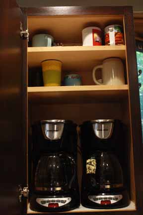
-put our coffee makers permanently in a cabinet. We drilled holes in the bottom, pulled the cords through - and voila, now we have a even more counter space!
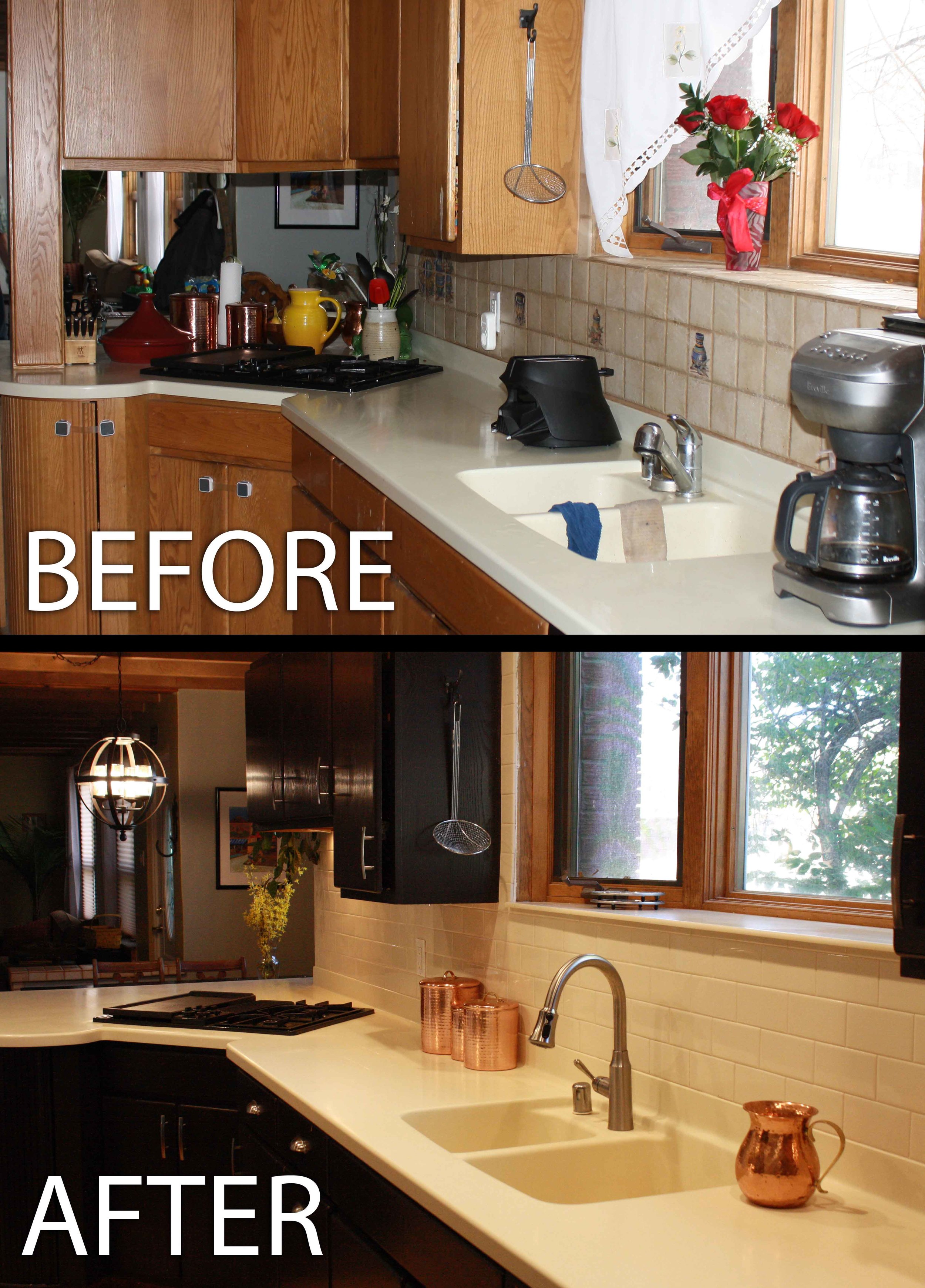
- Removed all the STUFF from counters: My husband claimed my orchid was dead (debatable but whatever). And he threw it away. We permanently put away anything we didn't use everyday., e.g., KitchenAid, tagine, Darth Vader toaster (despite protest from the hubby) etc. Now we don't have a bunch of random junk on our counter tops and we don't look pro-Dark-Side.
- We bought pretty baskets from Ross to put any random cereal/bread/goldfish/snacks that accumulated on top of our fridge.
- Removed toddler locks. I am actually regretting that...
Yes, that upper pic was the "clean version" of my kitchen. I don't miss those cabinets at all.
Isn't the orbital chandelier awesome? I feel like a little mini-motorcyclist-leprechaun from a 1950's circus could do some awesome tricks in there...
Okay so I went a little crazy testing grouts but I am so glad I did! The Mapei Bone grout is way lighter than the color chart said it would be. Dark grouts are great for floors because they hide dirt. But - we decided to go with the light grout because A) it is on the wall so won't get dirty as easily, and B) a dark grout would create long, crazy contrasty-busy-looking patterns. We have a alley kitchen, so we don't need anything making it feeling longer or narrower... Also, we found that the thinner grout lines seemed crisper and cleaner. There were no spacers used when installing the back splash (the almond-colored subway tiles have a little bump on the edges so there still is about a 1/32" gap).
Again - we were really tired of having STUFF take up all our counter space, so we put the coffee makers in the cabinet. Yep - they are plugged in and functional, so you can open the cabinet, grab a mug and choose decaf or regular! Genius...


