How to get people to look at your website

Congratulations, your website looks spectacular!

But how do you get more people to visit the site, stay long enough to get interested in buying your product, come back and tell others?

Collect visitors’ contact information and follow up.

In most cases, you won’t be able to make a sale the first time someone visits your site. Accept it. But that doesn’t mean they won’t become your customers later.

Make sure that you collect their information right away. How?

You give them something in return for their email address. In most cases it is information. A free report or download with a title that intrigues your target audience. They need to find the information valuable enough to give you their email address.

Then what?

Follow up with an autoresponder series

Email management programs like Constant Contact and Mail Chimp let you create a series of emails that can be automatically sent to people when they sign up for your list. That way you can follow up with new subscribers, establish rapport, and send them back to your sales page without having to individually email each person.

An autoresponder series can look like this:

Email 1: Welcoming the person to the list and delivering the promised piece of information.

Email 2: Personally inviting the person to join a facebook group or like a page.

Email 3: Tell a story about how a client solved a problem or overcame an obstacle using our services.

Email 4: Showing the person a link where they can access your blog archives.

Email 5: Providing answers to common questions.

You get the idea. Each email reminds the person that you exist and gives them a chance to think about buying from you.

Add content on a regular basis

Adding new pages to your site is one of the best ways to improve your search engine ranking, and give you something of substance to share on your social media networks. You can add new pages, or simply add a blog to your site.

But what should you write about?

  • For every question that your customers have, dedicate a page to answering it.
  • Create some pages showing how you do different parts of your job.
  • Write a page about yourself, your interests and your quirks.
  • Make a list of problems that your customers face, and write about how to solve those problems.
  • Write a success story about one of your customers.
  • Interview someone who has information that would interest your customers.

The sky’s the limit when it comes to content. Just think about what your customers want to learn about.

The way you present the online content makes a difference.

There are simple tricks that get people to more people to read your content.

Put your introductory paragraph in boldface print or in a larger font than the rest of the article. According to Conversion XL, when subjects in an online readership and eye tracking study encountered an article with a boldfaced introductory paragraph, 95% of them read all or part of the story.

Make the first sentence short. If something looks hard to read, people will avoid it. Often, website visitors skip over and completely ignore large chunks of text. All you have to do is break up your ideas into one or two sentence paragraphs.

Try placing your illustrations on the right side. People are more likely to pay attention to text, and they scan in an F pattern starting on the upper left hand of the page. It makes sense to have your headline be in the upper left hand of the page and the picture aligned to the right.

Having a beautiful website helps your business make a good impression and impacts people on a subconscious level. Content helps you keep people interested, follow up and make the sale. If you would like more ideas on how to come up with content for your website, visit www.mandymarksteiner.com to download a free copy of the “Blog Brainstormer” worksheet.



5 questions you must ask before hiring a logo designer

You have an amazing business idea and you’re ready to change the world, and make some money in the process.

But if you want to attract customers you need an identity that people will remember. Before you can make a website, manufacture products, design ads, or even print out business cards you need a logo to hold everything together.

Your logo is the face of you your company. It can visually reinforce your company’s values and has the power to forge a subconscious emotional bond with your customers.

When you’re getting started, your logo plays such a big role establishing a good relationship with your customers. You want to hire a graphic designer that can get it right the first time.

But it is up to you to give them the information they need to create a logo that will make the positive impact you need to make a profit. Before you contact a graphic designer, here are some questions you need to ask yourself:

1. What three words describe my company?

Think this over. Stay up all night thinking this over. Ask other people what they think about your idea and what they want to see in your business. Research how other successful companies describe themselves. After gathering all this feedback you want to boil it all down to three perfect words. Tell your designer what those words are.

Yes, you will end up telling your designer as much as possible about your company (how big it is, what your business goals are, everything).  But your logo needs to express one strong and concise message. What are those three words?

2. Who is my target audience?

A good graphic designer will create a logo that will appeal to your target market. Find out as much as you can about your target customer. Details like: How old are they? What kind of money do they want to spend? What other products do they love? Be prepared to give your designer this information. If your graphic designer doesn’t ask a lot of questions about your customers, take it as a bad sign.

3. Where will this logo be promoted?

Is it going to be on a tiny label, only online, or printed a silk tag sewn to each of your products? Is it going to be on an app? Printed on a fake brick (yes, I have seen that) or up on a billboard? If you have a storefront, will the sign be in neon, carved out of granite, or cut out of glossy sheet metal? Think of all these ideas, because your designer is going to create something that will work in context that you choose.

4. How can I tell if a designer is as good as they say they are?

Check out designers via their portfolio – do you like their style? Resume’s are an important way to show you their experience, but it’s more important to see proof that that they can design. Make sure you like what they have already done. Also, see if they have done work in your industry.

It’s simple: If you don’t like what’s in their portfolio, don’t hire them. If they don’t have a portfolio, certainly don’t hire them – you don’t want to be someone’s first project.

5. What is my budget?

Logos can cost anywhere between $5 and $50,000+. What should you spend?

I don’t want to spend a lot of time talking about the $5. If you spend $5, you are either paying someone to get it done in under a half hour, or you’re or you’re asking them to work for free.  A logo is an investment, and if you don’t invest in it, don’t expect a lot of return.

I’ve had several clients come to me after buying a $5 logo that looked like it was done in less than five minutes (it probably was!). They were happy to pay to get something they could be proud of.

Still, there’s a huge range in logo prices. How do you set a budget?

I charge between $1,200 and $2,200 for a logo. I meet with the client for a project interview, conduct research on the company, and create up to three good logo options and then give them three rounds of revisions. The fee gives me plenty of time to deliver my best work, and my customers are happy because they get what they want without having to redo anything later.

When you’re setting your budget consider how much you can afford to spend, and how much you are planning to make.

In the end, you need to respect the prices that the designers set. Shop around to find designers with a range of prices and ask yourself if the quality of their work justifies the price. Then hire the best designer that you can afford.

Some very basic typography definitions and tips...

Quick definition: Typography is "the art and technique to make written language legible, readable and appealing"(Wikepedia). Selecting fonts, sizes, and spacing between lines (leading) and letters (kerning) can make all the difference to create a project thats easy to read as well as attractive. 

Ahh, typography - the art of making the beautiful written language, well, functional. The first thing to think about when working on the typography of the project is: What is the goal of this typography. THE GOAL.

The goal of typography is not always to look pretty. A pretty little sign with skinny letters that look like they were copied off a pumpkin spice latte Starbucks sign aren't going to grab your attention when you're looking for an emergency exit. You want to be rescued by the  big ol muscly EXIT sign letters, lit up with green and neon and glowing! Figure out what the GOAL is - if it is to grab attention - you want big, bold, unique - something that stands out. If you're goal is to focus on the content, e.g., the typography of a novel or a New York Times article, you don't the typography to take away from the content - so you might use something simple and plain, such as Times New Roman.

Here's some quick tips and definitions on typography:

How do you choose a font? Once you figure out the goal, explore different options. Adobe TypeKit offers a library with your subscription DaFont offers thousands of free fonts (although for commercial use you might need to pay a bit). Treat your project like it has a personality. If you want you're article to be loud and outgoing - choose a font for headings that reflects that. If your brochure on cancer to be professional and serious, sure as hell don't choose comic sans. 

How do you choose a size? Hierarchy, Hierarchy HIERARCHY! It took me years to learn to pronounce that damn word... If something is more important, make it bigger. Size, in this case, does matter. Bigger usually means 'read this first'.

What is leading? Space between the lines. Ever see a document that the lines are so close together that it makes you sick - yep, bad typography. To spacey that you lost your place? Those folks need to work on leading (space between the lines). You can usually eyeball this with practice, and if you don't know what looks good - use the auto function... But once you know the rules - break them!

What is kerning? Adjusting the space between the letters. Ever see a sign with awkward gaps between the letters and in the end your not totally sure what the sign says? ("Therapist will be with you shortly" is a lot less scarrier than "The rapist willbewith you shortly") Those peeps need to work on their kerning. My advice? You usually don't want to mess with the kerning. Font designers spent ages on creating the perfect spacing between their letters - chances are you aren't going to make it better. And again - once you know the rules - break them!


Okay - I have to admit when I was studying digital media arts there is so much focus on how to use software that some major design principles get swept away.  If you are new to designing, I highly recommend Robin Williams (not the funny one) book called "Non designer's design book" and make sure you apply is CRAP principles (Contrast, Repition, Alignment and Proximity). 

Contrast - Notice the differences between sizes and fonts. If you hardly notice the difference, don't make it. 

Repetition - Continue to use the same styling throughout the your project that way the user quickly recognizes what goes with what.

Alignment - Use a grid and columns - you want to put your words and paragraphs in a place for a purpose - i.e., it makes it easier to read in the order you intend. Left align lengthy paragraphs - again, easier to read. Don't forget people are lazy - even their eyes are lazy! So lazy that they want to know exactly where they are supposed to look next, so use alignment as your yellow brick road from paragraph to paragraph. 

Proximity - Figure out who and what belongs next to what. A paragraph that's drifted away from it's header - in a sea of other paragraphs is going to get lost. 

Overall, think about that initial GOAL of the project, and you can decide how you want your type to function to accomplish that goal. 

Before you hire a graphic designer...

How do you pick a graphic designer? My advice is checkout several. Don't ask them to do free work (i.e., make a pitch for you or show you 'what they can do'). Instead, check out their portfolio. This is going to tell whether or not you like their style. Don't let anyone convince you they can do something - let them show you that they already have.

Once work begins, they should extensively ask about your business goals with the project and about your audience needs. 

Know the difference between an artist and a graphic designer.

The difference between an artist that paints a canvas for example, and a graphic designer is:

- An artist expresses themselves and makes something beautiful.

- A a graphic designer solves a communication problem via graphics. They need to know your audience. Their end result might not be beautiful if beautiful is not the end need (e.g., and emergency exit map should stand out with bold colors - not blend in beautifully...)

Side Note: Graphic designers are artists though and they do have a particular style. You need to research this style via their portfolio when you hire them and then you need to trust their artistic instinct (after all, that's what you hired them for!). There is nothing sadder then a client that is bailing out a lot of money and insists on using a color or font that looks, well terrible. 

Here are my a couple graphics that the designer (or lack there of) did not consider the audience:

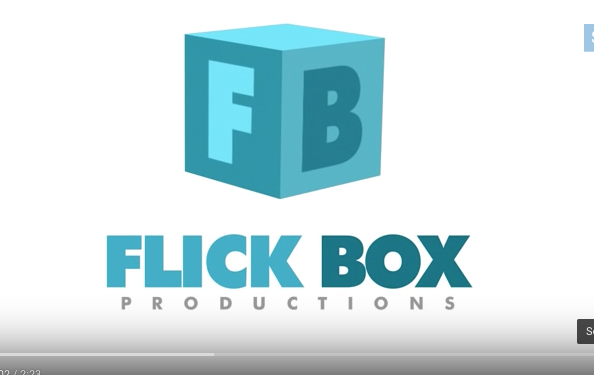
The L and the I are so close, I did not think this said Flick the first time I opened it... Flick Box is a Kids Songs and Rhymes channel - besides the instant view of a major potty word, this logo doesn't really scream kid friendly - wheres the colo…

The L and the I are so close, I did not think this said Flick the first time I opened it... Flick Box is a Kids Songs and Rhymes channel - besides the instant view of a major potty word, this logo doesn't really scream kid friendly - wheres the color? and the hand written words? The audience (kids) probably were not considered for this design.

The words FREE BEER gets anyone to stop - but only to find out there is. no. free. beer... tear! Clever, but we walked passed this bar and moved on to the next because the sign pissed us off. The audience (us beer drinkers) deemed it a fail. It…

The words FREE BEER gets anyone to stop - but only to find out there is. no. free. beer... tear! Clever, but we walked passed this bar and moved on to the next because the sign pissed us off. The audience (us beer drinkers) deemed it a fail. It seemed super harsh considering how expensive beer is in Iceland!

Why should you hire someone who calls themselves an artist, i.e., a painter or whatever?Because self expression, even in the midst of a busy city walk way - is beautiful, and art is part of a culture that makes us human. Oh - and that beautiful moment is worth paying for so support your local artists! Hows that for an answer? ;)

Cat staring at painting in Reykjavik, Iceland.

Cat staring at painting in Reykjavik, Iceland.

Good luck on your next project. And, I would be interested to know: what graphics have you seen that seemed to lack audience input?

Magical Princess Birthday Party Ideas

Party Disclaimer: I love having parties. The best part? Getting ready for them. My main advice is that if you ain't having fun, then don't do it! Having a party can be super stressful if you don't plan ahead and if you are trying to create a bunch of crap you saw on Pinterest that you're not really excited about. IF you are excited about the crap you saw in Pinterest, then do it! But most importantly have fun. 

Choose 2 or 3 "projects" to do to make the party extra special. For this Frozen party, I chose to do awesome-photoshopped birthday invite of my girls as princesses, an Elsa Barbie cake, and an Olaf piñata. Here's how:

1. Photoshopped invite: I put my girls in their princess dresses thinking I would get an adorable picture of them both smiling at the same time. Yeah right. Instead I took the funny pictures of them in character wearing their dresses and put it over a Frozen scene. Added text, some graphic elements & filters - and Bam!, Awesome Invite. Don't know how to do that? Call me. ;)

2. Princess Barbie Cake - There are a lot of videos on how to make one of these by baking your cake in a bowl to create the shape of your dress. My sister used to do wedding cakes, and she said that's not that great of a way because it can come out uneven. INSTEAD, bake a bunch of sheet cakes, and freeze them. Then, stack the cakes, cut a hole in and insert barbie (w/ hip joints wrapped in plastic). Then shave the cake into a dress, and frost. We made marshmallow Fondant (1 bag marshmallows, 1 bag powdered sugar) to create the dress this video and Fondant Snowflake Cutters to create snowflakes for the cake and cupcakes - but you could just use regular frosting. In fact, if you want to keep it fun (and in my case, not hear your husband say a bunch of potty words while I made him roll out fondant that wouldn't stick together... ) then just use regular ol' frosting. But, if you are over ambitious watch this video by Ann Reardon.

3. Olaf Piñata. If you've never made a pinata, It's a lot of fun but super messy. You just mix flower and water to a glue -like consistency and dip in strips of paper. You glue these strips in a thin layer around a balloon (or several to cut and create final shape), wait till it dries, and repeat until its a few layers. Once it fully dries, you pop the balloon, glue together with a hot glue gun the shapes you need (we used to circles, and cut the top of of one). I added a layer of duct tape around the thing and create a loop to hang the piñata. I also added more duct tape where I saw fit to make it more difficult to break. Use hot glue to decorate with tissue paper to decorate. Because we had a bunch of two year olds, they got to hit it with a foam sword (did nothing) and then I had my hulk-of-a-brother bust it open with one swing with a stick. Pixie sticks went flying ten feet in the air, and needless to say, the princess guests were thrilled...

Other things we did: Goodie bags with bubble and Frozen tattoos (no more candy please!), Frozen Punch (Mix 50/50 Hawaiian Punch w/ Sprite), and a Blue Chocolate Fountain. 

To Make a Blue Chocolate Fountain: Add Wilton Candy to your chocolate fountain. We used three 12 oz bags and then added about a half cup of Vegetable Oil to help it run Smoothly. We used Marshmallows and Oreos to dip in. Note: DO NOT ADD NON-OIL BASED DIE TO WHITE CHOCOLATE. Adding a non-oil based liquid to chocolate will cause it to cease up.

That's all for now! Hope you're party is magical. And, well - hire me if you want that awesome invite! ;)

How to create color palettes with your iPhone

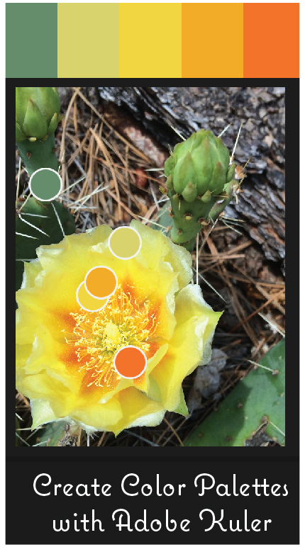
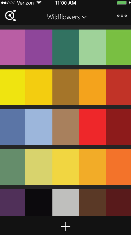
The Adobe Kuler App rocks. It takes a photo from your phone and creates a color palette. You simply download the app, press the little "+" sign, decide what photo to use, and BAM! Color pallette created. You also have the option of choosing what type of color palette: Colorful, Bright, Muted, Deep, Dark, or Custom (you choose).

Check out these palettes I made using pictures I took of wildflowers around Los Alamos (and one Jemez).

Can you guess the wildflowers I used for the following palettes? (Answers at the end of this blog)

If you are an Adobe user - you can place them in libraries and then sync it with your adobe libraries. I created a wildflower library.

How is this so useful? I had a client ask me to color her logo using colors from a candle. I gave her lots of color options, but the option below I could show her directly how I used her candle for that particular color option.

Interested? Check out the instructional video below. As for the flowers we have: Purple Geranium (Los Alamos -  Quemazon Nature Trail), Prickly Pear Cactus (Jemez - McCauley Hotsprings Trail), Scarlet Penstemon (Los Alamos -  Quemazon Nature Trail), & Yellow Blanket Flower (Los Alamos -  Quemazon Nature Trail). Have fun creating palettes!

Thanks for reading!

Quick Tips on How to Design a Party Invitation

Invitations. Here are the basics that I discovered while recently designing an invite for my sista's baby shower: As for layout - block out spaces in an un-symmetric-like manner. Divide text with images/graphics that are party-themed and don't be afraid to vary texts sizes and styles. If there is too much white space that looks uneven, add a dotted line or a little graphic to balance it out.  If you want to do this for cheap, print the invitation out on your own paper and glue to the top of whatever scrap paper you have and top with whatever ribbon you have. Thread a ribbon through the top to give it a personal touch.  See example below.

Yes, I know, I can't cut straight with scizzors. or spell sciszorzz. 

Yes, I know, I can't cut straight with scizzors. or spell sciszorzz. 

Another take on the same invite

Another take on the same invite

and, yeah, don't use pinky-red and purple together.

and, yeah, don't use pinky-red and purple together.

How to Find Free "Inspiration" & Medieval Cookies

I used to be so nervous about copyrights. Everything is copyrighted! I mean come on, you can't even sing Happy Birthday in a restaurant without having to pay someone a $700 royalty fee. (Yikes, flashbacks of me as a waitress singing - I DONT KNOW BUT IVE BEEN TOLD - SOMEONE HERE IS GETTING OLD! yep, those awful yet joyfully embarrassing songs are due to dang copyrights.)

"Inspiration" and "stealing ideas" might be used interchangeably. Unless, you tap into the incredible non-copyrighted world which includes: Everything God created (make that floral pattern from YOUR photos of YOUR flowers! there's an idea!) , public domain such as (most) photos from .gov website or creative commons and anything SO OLD that well, no one is coming to sue you. How old? Read more from the government himself.

So! I took the following photos for free ancient "inspiration". You can see that swirls, hearts, and beautiful patterns are not a new thing. This does not mean use other people photography of ancient things - you gotta go take the photos. I also don't mean replicate this stuff and claim it as your work. This is solely inspiration and can be used as such.

Random photos from my traveling days. I'm sure you can find some inspiring patterns closer to home.

Random photos from my traveling days. I'm sure you can find some inspiring patterns closer to home.

Disclaimer: It's been a while since I took copyrighting and perhaps some information has changed or will change. Either way, I am not a lawyer just a designer aka right-brained aka not a lawyer!!! Please do some more research if you have more questions or send me a comment :)

Now I also took some photos of some medieval looking tiles at a park in Spain. From there I created a medieval color palette using an eyedropper tool (Don't have a program such as Photoshop or Illustrator? Try freeware such as ColorZilla or Gimp to figure out colors!). Then I created some medieval cookies for the sole purpose of well, because it was a creative outlet and my hubby loves sugar cookies. Anyways, here are the results:

This looks complicated, but not really. Mix Royal Icing and add blue, green food coloring. To make gold, add about 10 drops of yellow to every one drop of blue and one drop of red. Pipe using parchment/wilton cone or if you're cheap like me, a plast…

This looks complicated, but not really. Mix Royal Icing and add blue, green food coloring. To make gold, add about 10 drops of yellow to every one drop of blue and one drop of red. Pipe using parchment/wilton cone or if you're cheap like me, a plastic baggy and snip off the corner to create thin lines. When photographing, position cookies so you don't see any major mistakes :)

I learned how to create thin lines on cookies from Julia M. Usher. She is awesome!

Creating Color Palettes from Nature and Photographs

Colors can either harmonize with each other or create a total disgusting cacaphony. Here's a quick example: When we first moved into our house the cabinet color seemed SO UGLY! It was SO YELLOWY! The walls were a creamy yellow as well so the kitchen just made me feel a bit sick. My mom (artist and momma for 30 plus years) suggested instead of ripping out the cabinetry, just change the colors of the walls! We painted them a blue-grey Sea Haze.  The sea haze complemented the warm yellow of the cabinets and made the kitchen look inviting and well, warm! WOW. I just saved myself 10,000 remodling costs by just painting the a complementing color!

Picking a color palette for anything from your business to your kid's bedroom may be a daunting task. Luckily, there is lots of help out there. If you don't know your basic color theory I highly recommend this video by Karen Kavett. I am constantly visiting Color Scheme Designer 3: This site will generate colors schemes if you input the hex # for one color. E.g., you love bright purple for your living room. What the heck goes with that? Enter the hex # of the purple - or pick it out on the color wheel and you can come up with some solid color palettes (monochromatic, triad, complementary, so on). Easy.

Well, lets say you want something a little more custom. My theory is that when you look at a harmonic color palette it probably reminds you of something you see naturally. I threw together a few photos to show you some examples below: 

I created these from photos I have collected over the years in Boston, at the Zoo, Organ Mountains in Southern New Mexico, Paris (photo by my sister Kristen), hiking in California, etc. I'm sure you don't have to go too far to find something similar.

Tshirt Designs: Screen versus Digital Printing

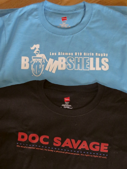
A new print shop is in town - JCS Printing. Josh Stringer (co-owner) printed out these lovely t-shirts I designed below. The black one is digitally printed and the blue one is screen printing.

What's the difference you ask? Screen printing you get a custom screen for your shirt (basically a giant stamp) that you can load with ink and get vibrant colors - especially on dark shirts. Problem is each design needs a custom screen setup (major chunk of the cost) - not ideal unless you need mass quantity and cheaper if you have less colors.

Digital, on the other hand, is much like printing with an Ink Jet printer - you can get loads of detail & colors. It slightly absorbs into the fabric so you don't get that ironed-on- design-t-shirt feel. It's also bit more economical because there is no custom setup. For my situation, Josh did the digital for the black shirts and although it printed a bit darker than my original design, they look awesome. 

The LA Rugby Bombshells is screen printing - ideal because there is only one color and they wanted it very vibrant on a darker shirt. They also needed loads of shirts and sweatshirts so the setup was worth the effort.

JCS printing had a quick turn around and Josh was totally about making the customer happy (for picky me, that was really nice!). Their company has competitive prices and is local (wha?!). They do t-shirt printing and pretty soon here will start doing embroidery (yay!). I'm going to monogram everything I own... Totally recommend them and will use JCS Printing again!

Yes. I am aware that everything in Los Alamos is bomb-themed.

Yes. I am aware that everything in Los Alamos is bomb-themed.

The front of the t-shirts.

The front of the t-shirts.

You can reach JCS Printing at jcsprinting@gmail.com or at 505-709-8885. 


Letterpress Printing

Gutenburg invented it. It's timeless. It's lovely. It's letterpress.

I tried out a local letterpress printer, 12 Tons of Letterpress, for some personal coffee bags.  Bram Meehan, the printer, sent me a photo of the press & printed bag (posted below!). The bags are beautiful. He does wonderful work - he can even print very thin lines. I complemented business card at an AIGA meeting and it was indeed 12 Tons of Letterpress work! The card was for Think all Day - the logo is a really thin T. It looked perfect.

Letterpress is printing old fashion style - using ink & a press - the main form of printing until the 20th century. It is currently used as an artisanal form. I highly recommend this printing if you want a one/two color 'stamped' feel to a project. Letterpress looks amazing for business cards and wedding invitations, and well, coffee bags!

IMG_0287.jpg

Designing Fabric

This is so much fun! I ended up making a custom fabric for my mother-in-law and daughters for Christmas! 

You can do this at spoonflower.com. They have great videos and ideas on YouTube - apparently you can make fabric from a photo! 

My m-i-l loves sewing so I made her a custom seal of the mountains behind their house in Montana. MY 18-month-year-old loves her dog so I made one with the dog and we always sing the Richie Valen's "Oh Donna" to our other daughter (Donna...) so that - in a nutshell -  explains the designs.  :)!

blog 2.jpg
blog 1.jpg

Gift Certificates

Gift Certificates for a service are an awesome gift because it allows your loved one to guilt-free get what they want & when they want it. Melissa (owner of FIT Massage) made some, put them in candy bags and tied off with a ribbon - they turned out quite cute:

Facebook advertisement for Los Alamos Local.

Facebook advertisement for Los Alamos Local.

Photography Project

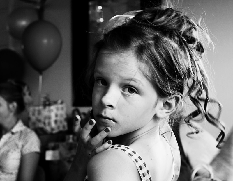
My sister Julia wrote beautiful journal entries to each of her children comparing them to "Fruits of the Spirit" - love, joy, peace, patience, kindness, goodness & self control. Pairing black and white photos of them made for a great photography project.

"But the fruit of the Spirit is love, joy, peace, patience, kindness, goodness, faithfulness, gentleness, self-control; against such things there is no law."
Galations 5:22-23