5 questions you must ask before hiring a logo designer

You have an amazing business idea and you’re ready to change the world, and make some money in the process.

But if you want to attract customers you need an identity that people will remember. Before you can make a website, manufacture products, design ads, or even print out business cards you need a logo to hold everything together.

Your logo is the face of you your company. It can visually reinforce your company’s values and has the power to forge a subconscious emotional bond with your customers.

When you’re getting started, your logo plays such a big role establishing a good relationship with your customers. You want to hire a graphic designer that can get it right the first time.

But it is up to you to give them the information they need to create a logo that will make the positive impact you need to make a profit. Before you contact a graphic designer, here are some questions you need to ask yourself:

1. What three words describe my company?

Think this over. Stay up all night thinking this over. Ask other people what they think about your idea and what they want to see in your business. Research how other successful companies describe themselves. After gathering all this feedback you want to boil it all down to three perfect words. Tell your designer what those words are.

Yes, you will end up telling your designer as much as possible about your company (how big it is, what your business goals are, everything).  But your logo needs to express one strong and concise message. What are those three words?

2. Who is my target audience?

A good graphic designer will create a logo that will appeal to your target market. Find out as much as you can about your target customer. Details like: How old are they? What kind of money do they want to spend? What other products do they love? Be prepared to give your designer this information. If your graphic designer doesn’t ask a lot of questions about your customers, take it as a bad sign.

3. Where will this logo be promoted?

Is it going to be on a tiny label, only online, or printed a silk tag sewn to each of your products? Is it going to be on an app? Printed on a fake brick (yes, I have seen that) or up on a billboard? If you have a storefront, will the sign be in neon, carved out of granite, or cut out of glossy sheet metal? Think of all these ideas, because your designer is going to create something that will work in context that you choose.

4. How can I tell if a designer is as good as they say they are?

Check out designers via their portfolio – do you like their style? Resume’s are an important way to show you their experience, but it’s more important to see proof that that they can design. Make sure you like what they have already done. Also, see if they have done work in your industry.

It’s simple: If you don’t like what’s in their portfolio, don’t hire them. If they don’t have a portfolio, certainly don’t hire them – you don’t want to be someone’s first project.

5. What is my budget?

Logos can cost anywhere between $5 and $50,000+. What should you spend?

I don’t want to spend a lot of time talking about the $5. If you spend $5, you are either paying someone to get it done in under a half hour, or you’re or you’re asking them to work for free.  A logo is an investment, and if you don’t invest in it, don’t expect a lot of return.

I’ve had several clients come to me after buying a $5 logo that looked like it was done in less than five minutes (it probably was!). They were happy to pay to get something they could be proud of.

Still, there’s a huge range in logo prices. How do you set a budget?

I charge between $1,200 and $2,200 for a logo. I meet with the client for a project interview, conduct research on the company, and create up to three good logo options and then give them three rounds of revisions. The fee gives me plenty of time to deliver my best work, and my customers are happy because they get what they want without having to redo anything later.

When you’re setting your budget consider how much you can afford to spend, and how much you are planning to make.

In the end, you need to respect the prices that the designers set. Shop around to find designers with a range of prices and ask yourself if the quality of their work justifies the price. Then hire the best designer that you can afford.

How to start a side business

According to a recent study, entrepreneurs who keep their day jobs are 33% more likely to succeed than those who take the "full plunge".* Starting a business on the side can enable you to test the waters of being a business owner, while not risking your finances or investing too much time.

Here are some steps I took to start my business on the side. In my case, I had two babies within one year (gasp!) so I did it 'on the side' of parenting. Now that I have more time and have been successful at a small scale, I am about to launch my business into a full time operation.

It can be really daunting to start a small business, but if you have the interest - I encourage you to give it a try! Before doing anything below, I suggest finding someone in your field who can act as a mentor. A goodfriend in town opened a massage business before I started - and her advice was so helpful (even though she was in a different field). I later met a business owner in my field who was about 10 years ahead of me, and she was a great resource to ask questions and advice.

Moving on, here's how I got started with little financial investment:

1. Made an appointment with the Los Alamos Business Center and applied for a business license and a Tax ID number. Try checking with you county of local chamber of commerce to figure out the legal paperwork to get started (business license, tax id number). I registered as an LLC. because that seemed to make the most sense liability wise. Sound confusing? Try to figure out who in your town helps small businesses grow, and then see if they offer free consulting to help you figure out how to start the basic license paperwork.

2. Opened bank account and open a bank account for my business. You want to keep checks from clients and money you spend completely separate from your personal stuff. This is really useful in figuring out how much income you made (and the taxes you need to pay on it) as well as how much you spent - and what you can deduct (which is A LOT of it).

3. Made an appointment with local accountant to figure out what taxes I need to pay. This was literally, the most daunting task. The first half hour was free, and I learned everything I need to know. I pay gross receipts twice a year online - which is super simple to do once you receive your tax id numbers and then I pay everything else during tax season via Schedule C on Turbo Tax. I ordered a DOME accounting book ($15?) and spent a couple hours figuring out how to use it. Once a month I open my bank statements and record deductible expenses, expenses and income (which is what I pay the gross receipts on). Not only does it prepare me for when taxes come around, it's a nice checkup to see if I am making or wasting money.

4. Emailed and researched local designers to see what they charge. A mentor in your field might be able to help you with this one. I had no idea what people charged for design. I emailed every designer I could find. Prices in my area went from $50 to $135 (usually the bottom price being $70, and marketers (that claim they can do graphic design) do it for less than that. A lot of people a product fee instead of hourly. Figure out what your expenses are and what you need to make to make sure your business doesn't go under. If you have high software costs, rent, daycare - whatever it is that is costing you money you need to make that back and then some. Or, what's the point? $60 sounded crazy high to me, but after taxes and expenses, its more like $15-$20 take home, which is proving to be fairly low. Currently, I am working towards developing a more product-based pricing.

4. Created a very basic contract and GOT DEPOSITS BEFORE WORK. Again - a mentor in your field, some online research, and/or a lawyer can help you figure out how to cover your butt. You need to decide ahead of time things like: time limits, revision limits, licensing and copy rights (your artwork? give them a limited usage right or crank up the price), you-don't-get-the files-if-you-don't-pay-me limits. You need to write down EVERYTHING you will deliver ahead of time, that way when a client asks for more, you can show them that that's not within the contract, and bill as needed. For designers, AIGA has great example proposals and contracts. Everything needs to be in writing, even if it's just in an email.

5. Met people and marketed myself. I emailed all the designers in town and met them. I am a big fan of collaboration, not competition when it comes to colleagues in town. I got to see what needs I could fill. I also did some pro bono projects (NOT DISCOUNTED, but free) that put me in front of eventual paying clients. I joined AIGA ($14/month) and met awesome mentors and people I could ask questions. I stay involved in my community, and make sure people know I exist. I made an online portfolio and this blog, and I constantly update it.

6.  Narrowed my focus. In the beginning I had time to work for a variety of clients and projects and now, I feel like I know what direction I want to pursue. I know my skills better. I want to be the best option for my clients and offer them design work that gives them results. I am figuring out what I can offer that is of high value to my client, and in return I can generate more income for my business. I learned to say no by nicely referring someone else. In design, it's best not to accept projects unless they lead to more projects or are good experience for your portfolio. Learn to say no to clients that aren't a good fit for you.

7. Continued my education. PODCASTS ARE AWESOME. I love Working Without Pants by Jake Jorgovan. He interviews loads of freelancers (while traveling across the world and working as a freelancer himself). I learned so much and was really inspired. I also am currently doing a Masters of Science at Arizona State University in Graphic Information Technology. I take classes at a snails pace (1 per semester usually) that way i have time to apply everything I learned. This obviously is not free, but there are loads of scholarships available.

8. Worked on my own self. It's important to be self aware and focused. I do several things to maintain the best version of myself like sleep and exercise. I also do self-checkups (did I take that too personally? Where is that person coming from?). Business success is a lot about learning to work well with many different people and personalities.

So that's it! Have you started a business? What was your process?

5 Reasons to Freelance

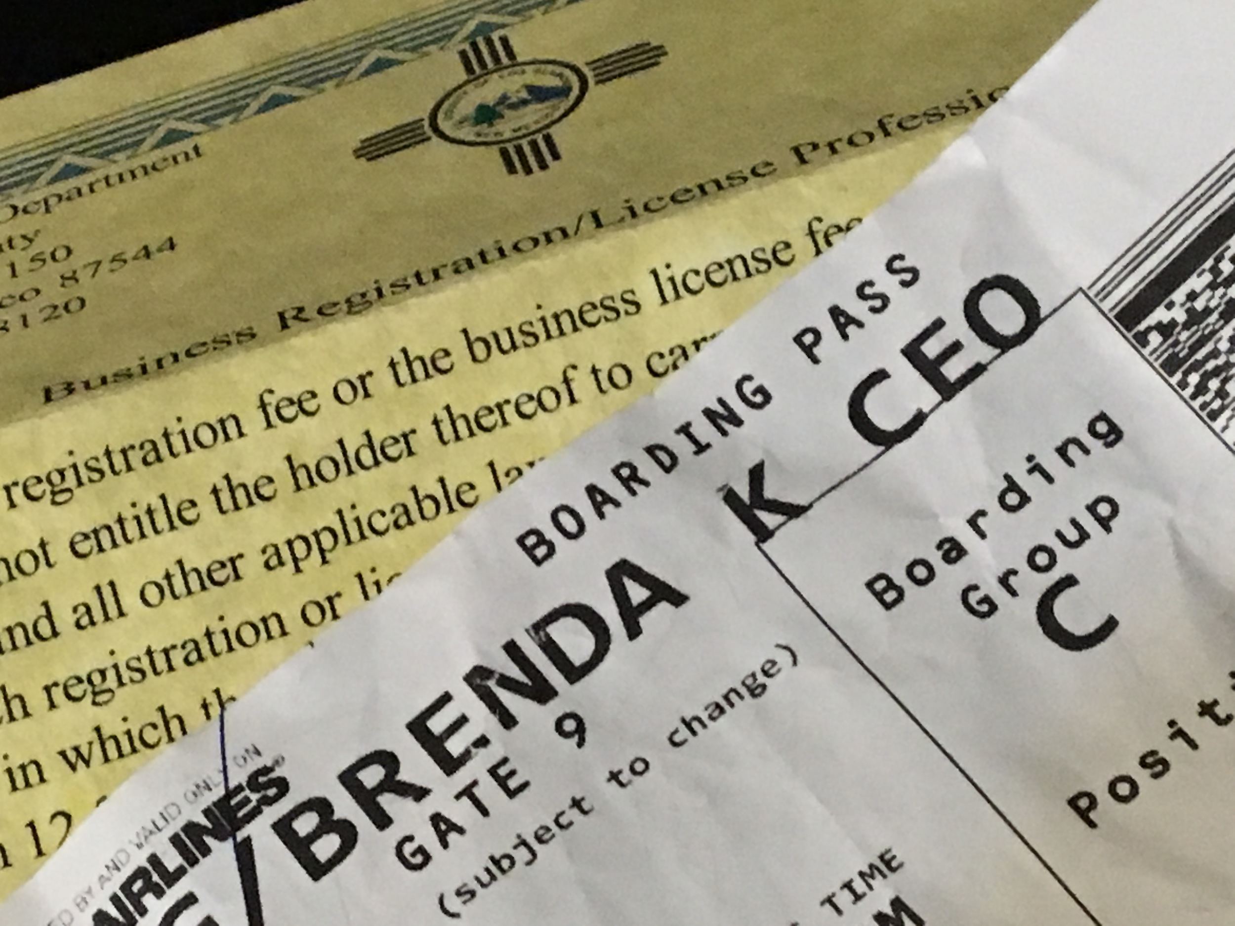
Okay, CEO is a stretch. But I am my own boss. :)

Okay, CEO is a stretch. But I am my own boss. :)

I just turned down an awesome full time position. By awesome, I mean consistent paycheck, wonderful co-workers and five minutes from my home. As a designer, there are three basic options for careers: freelance, work as an in-house designer or work for a design agency.

It was a difficult decision, but here is why I chose freelance: 

1. I get to choose what I work on (most of the time).  My passion is branding (logos, font pairing, color palettes). By freelancing, I can say no to projects that don't further me in my career. I have the opportunity to work with different businesses to expand my expertise in creating result-focused branding identities.

At first, Iworked for anyone who would pay me. But, as my business matures, I am starting to find my niche as a branding specialist. I want to stay focused, that way I can hone my skills and offer the best possible solutions to customers that need those focused services, ya know what I mean?

2. I get to choose my schedule. Choosing a schedule that works well with my family enables a happier and healthier lifestyle. I can work while my kids are in school and be available for them when they are home.

3. Harder work equals more pay. I am an extremely hard worker and very efficient. If I work for a salary, whether I am a good or bad worker means I get the same pay. Sure, I can get fired of promoted - but the payoff doesn't usually happen quickly. Freelancing, if I work to market myself and create amazing products that create results for my clients, they want to pay me, and continue to pay me!

Granted, if I slack off or no one wants to pay me - my business goes under. I gotta push myself to do really great work. That's a risk I'm worth taking because folks, this chick ain't no slacker.

4. Running a business is exciting. Some aspects aren't that glamorous - such as accounting and taxes - but it's fun to figure out. It's a big confidence booster knowing that I am in charge. Failure or success is in my hands. Muhahahaha! Hopefully I don't blow it... :)

5. I've worked as an in-house designer before. I totally value this experience. I had amazing managers that really challenged me. I loved it, but now I love going solo. Han Solo baby! There is no design agency in my town, so I've never had that experience but the but I try to replicate the benefit of an working with agency, which is working with other creatives, by meeting other designers whenever possible through AIGA events and coffee talks.

So - what's your position as a designer? In-house, Agency or Freelance? What are your likes and dislikes?


Homemade Letterpress and Embossed Cards

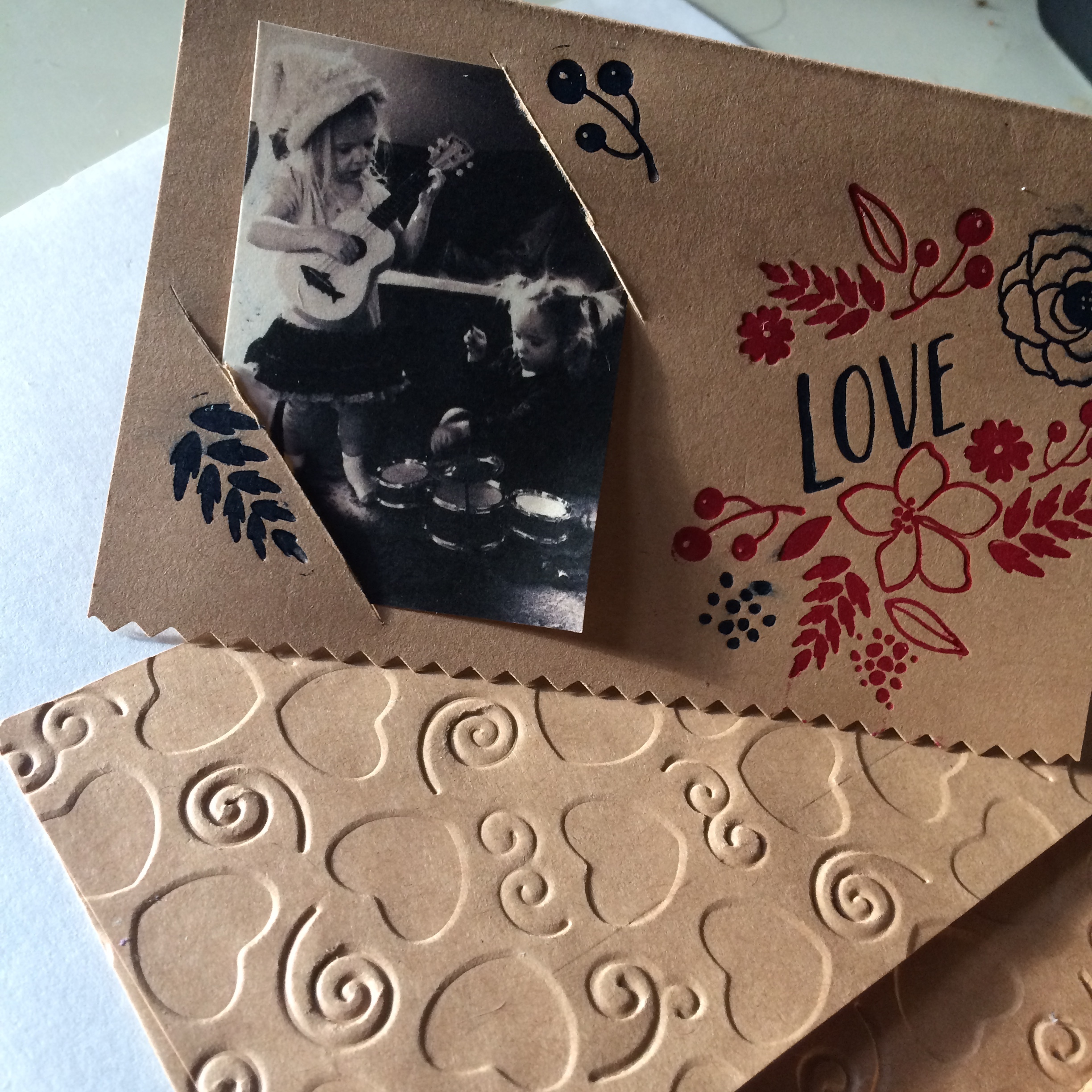
This is my latest project. My husband made the mistake of getting me a letterpress, die cutting and embossing kit (the evolution).  Above you can see the embossing on the envelope. The inked area is letterpress. This is the gateway to ultimate crafting. The coolest part? I can create for you custom letterpress plates. The plates cost about $30 to get created, and then I would charge you a separate design fee for the actual plate. This is an awesome way to fancy invitation, labels or any piece of paper you would like to give an authentic look.

Chocolate Lace Wrapped Pumpkin Cheese Cake and Pumpkin Shaped Bundt Cake

Chocolate Lace Pumpkin Cheesecake

A year or so ago I did a blog displaying aChocolate Lace Wrap I made using Julia Ushers tutorial - it was super minimal, and I realized people were searching for a template. So - as your thanksgiving present - I provided free for you a template to create your own pumpkin cheesecake chocolate lace wrapped thanksgiving indulgence of love. Your welcome.

What you need:

- Lace Pattern (Do not fit to page when printing)

- A nine inch pumpkin cheesecake (I created this one because of the nice flat top.)

- Godiva Chocolate melts or Chocolate chips

- Parchment Paper

- A long Board

- Gallon size plastic baggies

- Scissors

1. Cut out patter and tape together. Tape together to form a long strip, anddown to a long board (cardboard will work, I used a mini ironing board.) Place parchment paper on top - but have the bottom edge of parchment paper line just below the bottom edge of the pattern.

2. Melt chocolate in microwave according to directions (30 seconds, stir, repeat until you can stir the lumps out. Usually takes less then a minute and half). Spoon into plastic bag. Snip of a TINY bit of the edge so you can pipe a thin line out. Trace the pattern.

3. When finished, as soon as none of the chocolate is runny (but NOT hard!) wrap around the cake. Very carefully press it against the cake and the end edges together. You might have to use a little melted chocolate as glue to make those edges touch and stick.

5. Refrigerate until chocolate is hard. CAREFULLY move to table. The lace is very fragile! But once everyone sees your beautiful dessert - cut it open and enjoy!

Pumpkin Shaped Cake made with Bundt Cakes with homemade pulled sugar stem

What you need:

- Two bundt cakes, cooled

- Two cans of orange frosting

- Luster dust (makes it shiny/can get at hobby lobby, online, cake shop...) and sprinkles

- Red/Yellow Food coloring if you want to shade some of the frosting

-2cup sugar

- 2/3 Cup corn syrup (I use light corn syrup as it won't mess up the color)

- 4 tablespoons H20

- Few drops of food coloring (red in this case) and flavoring if you want it (cherry in this case)

- Thick Gloves (or several layers of thin ones

- Silpat or Parchment paper

Place both bundt cakes upside down. Using a bread knife, level the flat edges and save the extra cake. Frost the top of one bundt cake (usually the bottom) and place the other one on top to create a pumpkin shape. Use the excess cake from leveling to fill the center. Frost the cake. Create thick lines of frosting down the edges as in picture to create a pumpkin look. Add a bit of red to some of the frosting to add shading or different oranges colors to create a more organic look.

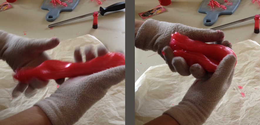
PULLED SUGAR CAN BE VERY HOT AND DANGEROUS - FIRST WATCH THIS VIDEO TO GET AN IDEA OF IT AND BE CAREFUL! Put sugar, corn syrup, water in pot and boil for ten minutes brushing edges with water until its starts turning gold. Poor CAREFULLY on silpat/parchment paper - allow to cool a bit. WEARING GLOVES, start pulling up edges. Add a bit of die Fold on itself, and gradually, once cool enough to pull up without sticking to your gloves, pull it up, fold on itself, pull and repeat until shiny. Once its cooled to the point where you can form it (within about a minute) twist a large chunk into a 5 inch stem shape. Twist smaller parts into vines. Cool completely.

Press stem into center of cake (like a candle). Add whatever vine like pieces around. Finish off with luster dust.

Hope you enjoyed this blog -- Enjoy!


Some very basic typography definitions and tips...

Quick definition: Typography is "the art and technique to make written language legible, readable and appealing"(Wikepedia). Selecting fonts, sizes, and spacing between lines (leading) and letters (kerning) can make all the difference to create a project thats easy to read as well as attractive. 

Ahh, typography - the art of making the beautiful written language, well, functional. The first thing to think about when working on the typography of the project is: What is the goal of this typography. THE GOAL.

The goal of typography is not always to look pretty. A pretty little sign with skinny letters that look like they were copied off a pumpkin spice latte Starbucks sign aren't going to grab your attention when you're looking for an emergency exit. You want to be rescued by the  big ol muscly EXIT sign letters, lit up with green and neon and glowing! Figure out what the GOAL is - if it is to grab attention - you want big, bold, unique - something that stands out. If you're goal is to focus on the content, e.g., the typography of a novel or a New York Times article, you don't the typography to take away from the content - so you might use something simple and plain, such as Times New Roman.

Here's some quick tips and definitions on typography:

How do you choose a font? Once you figure out the goal, explore different options. Adobe TypeKit offers a library with your subscription DaFont offers thousands of free fonts (although for commercial use you might need to pay a bit). Treat your project like it has a personality. If you want you're article to be loud and outgoing - choose a font for headings that reflects that. If your brochure on cancer to be professional and serious, sure as hell don't choose comic sans. 

How do you choose a size? Hierarchy, Hierarchy HIERARCHY! It took me years to learn to pronounce that damn word... If something is more important, make it bigger. Size, in this case, does matter. Bigger usually means 'read this first'.

What is leading? Space between the lines. Ever see a document that the lines are so close together that it makes you sick - yep, bad typography. To spacey that you lost your place? Those folks need to work on leading (space between the lines). You can usually eyeball this with practice, and if you don't know what looks good - use the auto function... But once you know the rules - break them!

What is kerning? Adjusting the space between the letters. Ever see a sign with awkward gaps between the letters and in the end your not totally sure what the sign says? ("Therapist will be with you shortly" is a lot less scarrier than "The rapist willbewith you shortly") Those peeps need to work on their kerning. My advice? You usually don't want to mess with the kerning. Font designers spent ages on creating the perfect spacing between their letters - chances are you aren't going to make it better. And again - once you know the rules - break them!


Okay - I have to admit when I was studying digital media arts there is so much focus on how to use software that some major design principles get swept away.  If you are new to designing, I highly recommend Robin Williams (not the funny one) book called "Non designer's design book" and make sure you apply is CRAP principles (Contrast, Repition, Alignment and Proximity). 

Contrast - Notice the differences between sizes and fonts. If you hardly notice the difference, don't make it. 

Repetition - Continue to use the same styling throughout the your project that way the user quickly recognizes what goes with what.

Alignment - Use a grid and columns - you want to put your words and paragraphs in a place for a purpose - i.e., it makes it easier to read in the order you intend. Left align lengthy paragraphs - again, easier to read. Don't forget people are lazy - even their eyes are lazy! So lazy that they want to know exactly where they are supposed to look next, so use alignment as your yellow brick road from paragraph to paragraph. 

Proximity - Figure out who and what belongs next to what. A paragraph that's drifted away from it's header - in a sea of other paragraphs is going to get lost. 

Overall, think about that initial GOAL of the project, and you can decide how you want your type to function to accomplish that goal. 

Before you hire a graphic designer...

How do you pick a graphic designer? My advice is checkout several. Don't ask them to do free work (i.e., make a pitch for you or show you 'what they can do'). Instead, check out their portfolio. This is going to tell whether or not you like their style. Don't let anyone convince you they can do something - let them show you that they already have.

Once work begins, they should extensively ask about your business goals with the project and about your audience needs. 

Know the difference between an artist and a graphic designer.

The difference between an artist that paints a canvas for example, and a graphic designer is:

- An artist expresses themselves and makes something beautiful.

- A a graphic designer solves a communication problem via graphics. They need to know your audience. Their end result might not be beautiful if beautiful is not the end need (e.g., and emergency exit map should stand out with bold colors - not blend in beautifully...)

Side Note: Graphic designers are artists though and they do have a particular style. You need to research this style via their portfolio when you hire them and then you need to trust their artistic instinct (after all, that's what you hired them for!). There is nothing sadder then a client that is bailing out a lot of money and insists on using a color or font that looks, well terrible. 

Here are my a couple graphics that the designer (or lack there of) did not consider the audience:

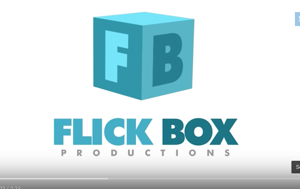
The L and the I are so close, I did not think this said Flick the first time I opened it... Flick Box is a Kids Songs and Rhymes channel - besides the instant view of a major potty word, this logo doesn't really scream kid friendly - wheres the colo…

The L and the I are so close, I did not think this said Flick the first time I opened it... Flick Box is a Kids Songs and Rhymes channel - besides the instant view of a major potty word, this logo doesn't really scream kid friendly - wheres the color? and the hand written words? The audience (kids) probably were not considered for this design.

The words FREE BEER gets anyone to stop - but only to find out there is. no. free. beer... tear! Clever, but we walked passed this bar and moved on to the next because the sign pissed us off. The audience (us beer drinkers) deemed it a fail. It…

The words FREE BEER gets anyone to stop - but only to find out there is. no. free. beer... tear! Clever, but we walked passed this bar and moved on to the next because the sign pissed us off. The audience (us beer drinkers) deemed it a fail. It seemed super harsh considering how expensive beer is in Iceland!

Why should you hire someone who calls themselves an artist, i.e., a painter or whatever?Because self expression, even in the midst of a busy city walk way - is beautiful, and art is part of a culture that makes us human. Oh - and that beautiful moment is worth paying for so support your local artists! Hows that for an answer? ;)

Cat staring at painting in Reykjavik, Iceland.

Cat staring at painting in Reykjavik, Iceland.

Good luck on your next project. And, I would be interested to know: what graphics have you seen that seemed to lack audience input?

Magical Princess Birthday Party Ideas

Party Disclaimer: I love having parties. The best part? Getting ready for them. My main advice is that if you ain't having fun, then don't do it! Having a party can be super stressful if you don't plan ahead and if you are trying to create a bunch of crap you saw on Pinterest that you're not really excited about. IF you are excited about the crap you saw in Pinterest, then do it! But most importantly have fun. 

Choose 2 or 3 "projects" to do to make the party extra special. For this Frozen party, I chose to do awesome-photoshopped birthday invite of my girls as princesses, an Elsa Barbie cake, and an Olaf piñata. Here's how:

1. Photoshopped invite: I put my girls in their princess dresses thinking I would get an adorable picture of them both smiling at the same time. Yeah right. Instead I took the funny pictures of them in character wearing their dresses and put it over a Frozen scene. Added text, some graphic elements & filters - and Bam!, Awesome Invite. Don't know how to do that? Call me. ;)

2. Princess Barbie Cake - There are a lot of videos on how to make one of these by baking your cake in a bowl to create the shape of your dress. My sister used to do wedding cakes, and she said that's not that great of a way because it can come out uneven. INSTEAD, bake a bunch of sheet cakes, and freeze them. Then, stack the cakes, cut a hole in and insert barbie (w/ hip joints wrapped in plastic). Then shave the cake into a dress, and frost. We made marshmallow Fondant (1 bag marshmallows, 1 bag powdered sugar) to create the dress this video and Fondant Snowflake Cutters to create snowflakes for the cake and cupcakes - but you could just use regular frosting. In fact, if you want to keep it fun (and in my case, not hear your husband say a bunch of potty words while I made him roll out fondant that wouldn't stick together... ) then just use regular ol' frosting. But, if you are over ambitious watch this video by Ann Reardon.

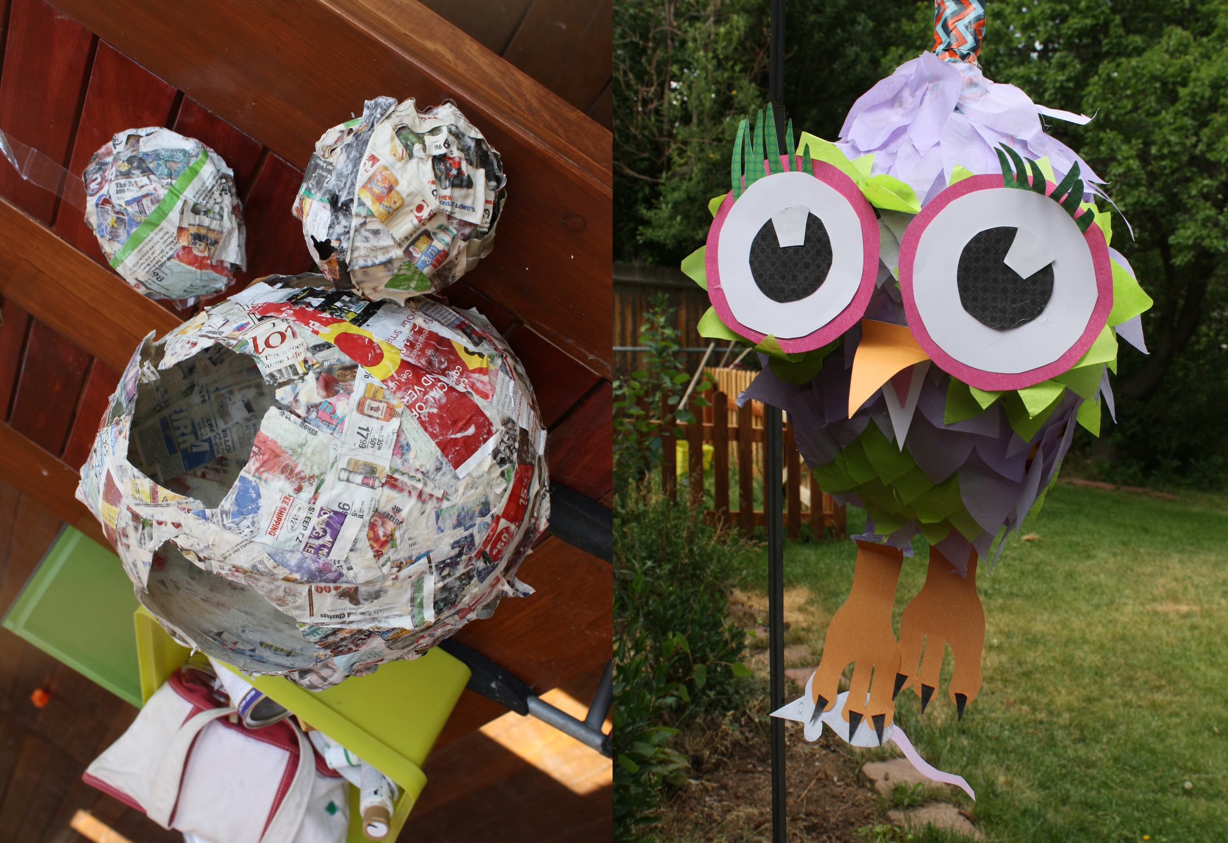
3. Olaf Piñata. If you've never made a pinata, It's a lot of fun but super messy. You just mix flower and water to a glue -like consistency and dip in strips of paper. You glue these strips in a thin layer around a balloon (or several to cut and create final shape), wait till it dries, and repeat until its a few layers. Once it fully dries, you pop the balloon, glue together with a hot glue gun the shapes you need (we used to circles, and cut the top of of one). I added a layer of duct tape around the thing and create a loop to hang the piñata. I also added more duct tape where I saw fit to make it more difficult to break. Use hot glue to decorate with tissue paper to decorate. Because we had a bunch of two year olds, they got to hit it with a foam sword (did nothing) and then I had my hulk-of-a-brother bust it open with one swing with a stick. Pixie sticks went flying ten feet in the air, and needless to say, the princess guests were thrilled...

Other things we did: Goodie bags with bubble and Frozen tattoos (no more candy please!), Frozen Punch (Mix 50/50 Hawaiian Punch w/ Sprite), and a Blue Chocolate Fountain. 

To Make a Blue Chocolate Fountain: Add Wilton Candy to your chocolate fountain. We used three 12 oz bags and then added about a half cup of Vegetable Oil to help it run Smoothly. We used Marshmallows and Oreos to dip in. Note: DO NOT ADD NON-OIL BASED DIE TO WHITE CHOCOLATE. Adding a non-oil based liquid to chocolate will cause it to cease up.

That's all for now! Hope you're party is magical. And, well - hire me if you want that awesome invite! ;)

How to create color palettes with your iPhone

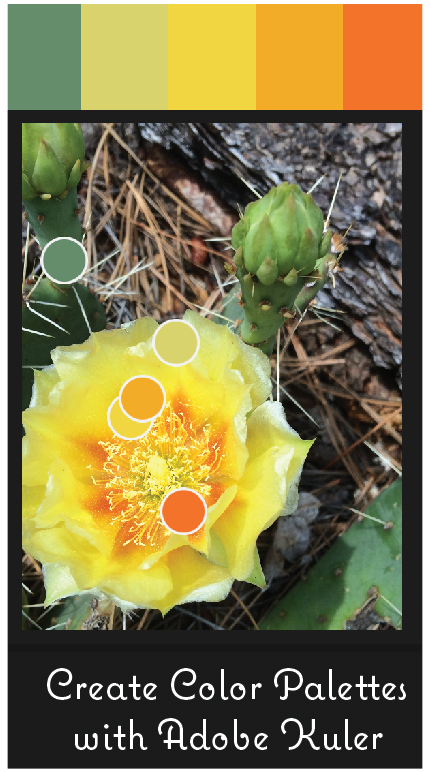
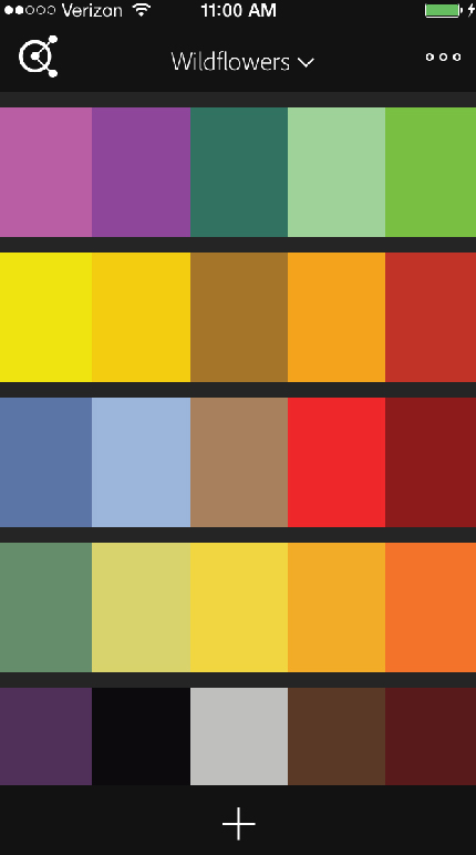
The Adobe Kuler App rocks. It takes a photo from your phone and creates a color palette. You simply download the app, press the little "+" sign, decide what photo to use, and BAM! Color pallette created. You also have the option of choosing what type of color palette: Colorful, Bright, Muted, Deep, Dark, or Custom (you choose).

Check out these palettes I made using pictures I took of wildflowers around Los Alamos (and one Jemez).

Can you guess the wildflowers I used for the following palettes? (Answers at the end of this blog)

If you are an Adobe user - you can place them in libraries and then sync it with your adobe libraries. I created a wildflower library.

How is this so useful? I had a client ask me to color her logo using colors from a candle. I gave her lots of color options, but the option below I could show her directly how I used her candle for that particular color option.

Interested? Check out the instructional video below. As for the flowers we have: Purple Geranium (Los Alamos -  Quemazon Nature Trail), Prickly Pear Cactus (Jemez - McCauley Hotsprings Trail), Scarlet Penstemon (Los Alamos -  Quemazon Nature Trail), & Yellow Blanket Flower (Los Alamos -  Quemazon Nature Trail). Have fun creating palettes!

Thanks for reading!

Kitchen Update on a Budget

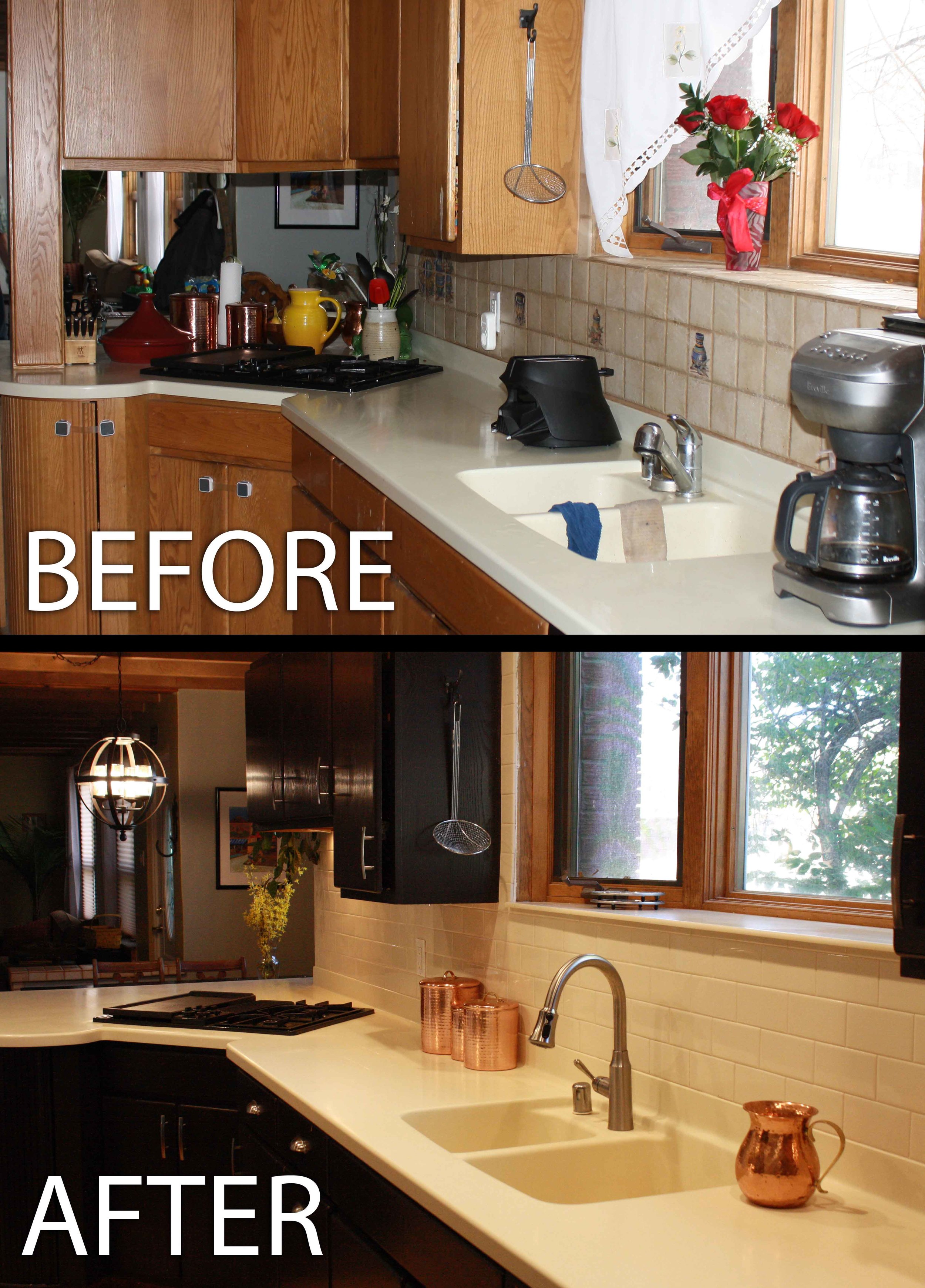
Our New Kitchen

Our New Kitchen

We drastically updated our kitchen without replacing any appliances, counter tops or cabinets, hence, it was pretty affordable!

Here is what we did:

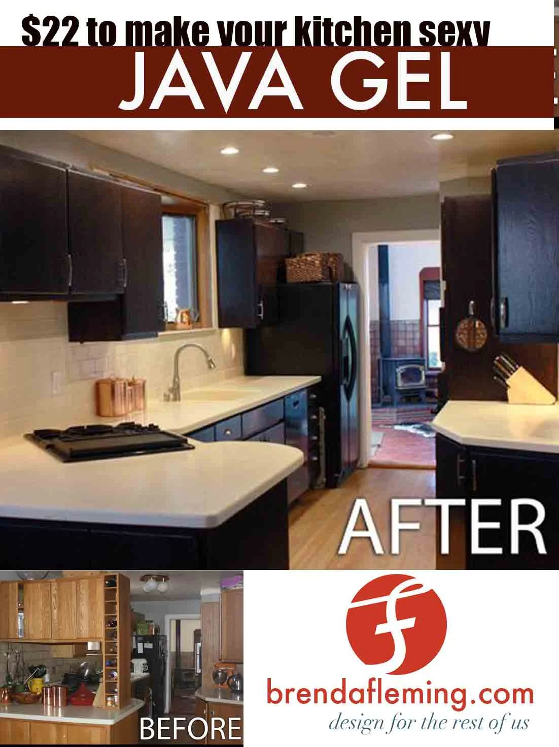
- stained the kitchen cabinets to a dark, stunning espresso color using General Finishes Java Gel

- added stainless steel bling (faucet and hardware). The faucet was an (awesome!) gift from Ian's parents - thanks John and Lydia!

- upgraded the lighting to recessed LED lights (seven total, our kitchen is SO bright now!)

- upgraded back splash to almond subway tile (EXACT same color as counters) and bone colored grout

- took out overhanging cabinets that blocked the dining room

- put an orbital chandelier over the table in the dining room

- refinished our Avonite countertops (this solid surface can just be sanded down to remove any scratches/dents)

What did we learn about interior design? KEEP IT NEUTRAL!

Initially I wanted a colorful glass black splash and funky pendant lighting - but thanks to my sister who is an amazing designer, we kept it all VERY neutral. Why? Because A) you can always have fun with accent colors, e.g., copper canisters or bright orange KitchenAid, and B) it makes our kitchen feel relaxing, like the inside of Starbucks.

Find a Reference Picture of Your Dream Kitchen.

When designing your kitchen, find a picture of a kitchen you love, and use it as a reference. Or a cafe, or whatever. Some stuff I initially wouldn't have chosen on it's own, but it looks great when it is combined with everything else, e.g., the stainless steel drawer pulls and recessed lighting. You don't have to copy everything, but having a 'concept' kitchen is a great way to not make a major mistake.  This was our concept kitchen. Again, we also thought of the interior of Starbucks...

Don't choose something that doesn't match the style of your house, like a kitchen with massive marble columns and views of a tropical beach - unless you have that... you lucky duck.

Go safe.

I initially wanted brown cabinets but we would have had to completely sand down our 1990's yellow-oak cabinets and restain them. Who has time for that? Luckily, there is stain you can apply over stain. (Minwax Polyshades and General Finishes). We chose General Finishes Java Gel. Why? Staining this dark of a color gives consistent and even results (versus staining with something like a Minwax Polyshade random brown that gave you a surprise new color when added to whatever color you previously had...) It wasn't what I initially wanted but looks so good that I cant help but love it.

A can of Java Gel is $22 and a little goes a long, long way. We bought less than two cans, and we have about 26 cabinet doors + drawers and frames. This was the most drastic change, and is insanely affordable.

The tiles/grout we chose was also the SAFE option because it would make the back splash NOT stand out.

Going safe and neutral might seem boring, but it gives you permission go wild with the things that are NOT permanent! Like funky canisters and ceramic chickens and massive signs that say "EAT" - then, when those things annoy you or get outdated, you can easily pick a new style! Or heck, be seasonal with your kitchen decor! Yay for Santa Claus cookie jars! I am going to have fun...

Other things we did were:

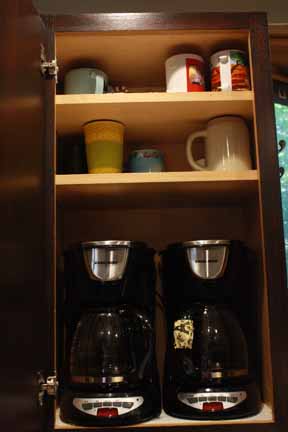
-put our coffee makers permanently in a cabinet. We drilled holes in the bottom, pulled the cords through - and voila, now we have a even more counter space!

- Removed all the STUFF from counters: My husband claimed my orchid was dead (debatable but whatever). And he threw it away. We permanently put away anything we didn't use everyday., e.g., KitchenAid, tagine, Darth Vader toaster (despite protest from the hubby) etc. Now we don't have a bunch of random junk on our counter tops and we don't look pro-Dark-Side.

- We bought pretty baskets from Ross to put any random cereal/bread/goldfish/snacks that accumulated on top of our fridge.

- Removed toddler locks. I am actually regretting that...

Yes, that upper pic was the "clean version" of my kitchen. I don't miss those cabinets at all.

Yes, that upper pic was the "clean version" of my kitchen. I don't miss those cabinets at all.

Isn't the orbital chandelier awesome? I feel like a little mini-motorcyclist-leprechaun from a 1950's circus could do some awesome tricks in there...

Isn't the orbital chandelier awesome? I feel like a little mini-motorcyclist-leprechaun from a 1950's circus could do some awesome tricks in there...

Okay so I went a little crazy testing grouts but I am so glad I did! The Mapei Bone grout is way lighter than the color chart said it would be. Dark grouts are great for floors because they hide dirt. But - we decided to go with the light grout beca…

Okay so I went a little crazy testing grouts but I am so glad I did! The Mapei Bone grout is way lighter than the color chart said it would be. Dark grouts are great for floors because they hide dirt. But - we decided to go with the light grout because  A) it is on the wall so won't get dirty as easily, and B) a dark grout would create long, crazy contrasty-busy-looking patterns. We have a alley kitchen, so we don't need anything making it feeling longer or narrower... Also, we found that the thinner grout lines seemed crisper and cleaner. There were no spacers used when installing the back splash (the almond-colored subway tiles have a little bump on the edges so there still is about a 1/32" gap).

Again - we were really tired of having STUFF take up all our counter space, so we put the coffee makers in the cabinet. Yep - they are plugged in and functional, so you can open the cabinet, grab a mug and choose decaf or regular! Genius...

Again - we were really tired of having STUFF take up all our counter space, so we put the coffee makers in the cabinet. Yep - they are plugged in and functional, so you can open the cabinet, grab a mug and choose decaf or regular! Genius...


Pulled Sugar Spirals - a perfect valentines day garnish...

cupcake.JPG

These are so much fun. How you ask? Pretty easy - but I definitely recommend two people, thick gloves and no kids - as melted sugar is HOT. I also recommend watching YouTube videos of pulling sugar first too so you get the general idea.


 You need

1 cup sugar

1/3 Cup corn syrup (I use light corn syrup as it won't mess up the color)

2 tablespoons H20

Few drops of food coloring (red in this case) and flavoring if you want it (cherry in this case)

Thick Gloves (or several layers of thin ones

Silpat or Parchment paper

Knife sharpener

Put the sugar corn syrup and water in a pot. Turn to medium heat and stir a bit until boils. Use a pastry brush with water to 'paint' off any sugar crystals that stick to the edge (these will make your end result cloudy) Then let boil for about 4-5 minutes. The minute you see a bit of it turn golden brown, take it off the heat and pour onto Silpat or parchment paper. It's ridiculously hot, so be careful.

Now you basically have a pile of hot lava. You need to put on gloves and wait a few minutes before touching it. Eventually you should be able to touch it (WITH THICK GLOVES ON) and pull edges up from the paper. If its still sticking to paper, its too hot. Once you can get the glob of melted sugar off the paper, basically keep folding it on to itself. Pull it out, fold it over, and repeat until it gets shimmery (this is because you introduce air into the sugar.) Now you have to work QUICKLY, because if you pull it out too thin, it will harden quickly. As soon as it shimmery, pull out a thin strand, wrap it around a knife sharpener, and cut it with scissors. First one done. Try to pull out, wrap and cut before all the sugar hardens. If it hardens before you finish, you can stick it in the microwave for small increments until it melts and start over. I recommend two people so one person can hold the knife sharpener while the other one wraps. Good luck! And don't burn yourself. And if you do a little, it's worth it


Christmas Party Ideas and Frozen Gingerbread Castle

Christmas parties are way too fun. Why? It's the time of year to give yourself a free pass and drink all the eggnog your stomach can handle (I have yet to discover my threshold). It's also a great excuse to cook from the Betty Crocker Christmas cookbook (cans of cheese soup as a main ingredient wouldn't fly come January). I am going to go ahead and say it: Betty Crocker Christmas cookbook is amazing. We use it every year, and it has the best, simplest, stress-free super tasty recipes. ( sorry fans - no quinoa or kale). Great gift idea - although maybe your mother has one that you can eternally borrow, like we did.. ;)

Betty Crocker Cheese Balls

Betty Crocker Cheese Balls

I have found to set a very beautiful food table, its a good idea to have different heights for serving plates - it adds a lot of dimension and makes a table look awesome.

For a fairly cheap decoration, put leftover tree branches with a few red roses in a jar. You can take off the top metal hanger-part of a round ornament, leaving a hole, and stick it upside down on a bamboo skewer to add another element to this Christmas bouquet. You can also glue a bamboo skewer to a pinecone.

Simple rose and tree branch bouquet

Simple rose and tree branch bouquet

As for drinks, here are the best ones we had:

Gingerbread Martini:  Mix with shaker/ice: 1 oz vodka,  1/2 oz Kahlua, 1 oz Gingerbread syrup*, 1 oz half n' half. Top with whip cream and gingerbread cookie.

* You can get Gingerbread syrup for 12.95 at Starbucks - they sell it behind the counter so you have to ask and in my case the employee wasn't too sure, so you might have to ask a manager.

Peppermint Hot Chocolate:  This you can leave on the stove top while people help themselves. Use Hersheys Cocoa (4 cups milk + 8 tbs cocoa + 4-8 tbs sugar) and add Peppermint Schnapps to taste. Top with whip cream, red sprinkles and a mini candy cane to get yourself ready to "Baby It's Cold Outside" karaoke.

Hand-painted Checkerboard Table

Sigh, I have two minutes to write this. 

For this project I wanted to tie in this previously red kids table with a pink & purple kitchen set I got for my girls' b-day's. I also wanted a checkerboard on it.

My advice when hand painting anything is make sure you have an example of what to look at. (In this case, I matched designs to the rug.) Plan it out in advance (i.e., draw out the project so you can get an idea of the final).

Also, use a ruler for the checkerboard and center it. I used 2" squares to keep it easy. My husband did the straight board using tape as a guide, but I hand-painted the checkers to tie in all the other hand-painted designs on this table.

 (don't trace everything out or you'll forever have some pencil marks)

Also, don't leave it outside when it's raining. That's it! hope you like it! 


Quick Tips on Professional Looking Photos: Using soft light

As a photoshop fanatic- I used to always just take photos with the idea that I could fix the lighting later - THIS IS FALSE! You can do a bit in photoshop, but you NEED nice lighting! Nice lighting is from either : a really fancy professional lighting kit (your regular ol flash is going to might just wash everything out) for you camera OR NATURAL light! That's right, gobs, and gobs of this come for free, each day from the sun. The problem is that direct sunlight is really intense and with the intense bright light come intense black shadows in your pictures. So, to utilize this beautiful light, you need it filtered. Here's a few ways to do just that:

1. SUNSET/SUNRISE Take at either right before the sun rises or right after the sun goes down for that beautiful, golden soft light. I found if you take a photo while the sun is still low in the sky you get really, really long black shadows.

2. NEXT TO A WINDOW Take the photo near a window with ample light through. Have your subject facing the light (don't have the light behind them) so it reflects on their face. 

Frankly both of these photos are pretty cute - but you can tell major differences in the quality of the photo. Flashes bring out everything - from alien eyes to shiny drool. Natural light gives that 'porcelain skin' look  and brighter eyes.

Frankly both of these photos are pretty cute - but you can tell major differences in the quality of the photo. Flashes bring out everything - from alien eyes to shiny drool. Natural light gives that 'porcelain skin' look  and brighter eyes.

3. IN THE SHADE - yep, pull the person in the shade or covered area so light comes through the sides and brightens them up. If the shade is tree, make sure there isn't any light spots shining through branches.


Covered porches are such an ideal spot for a family photo. Before an event (such as a wedding or reunion) scope the area for potential places (big windows, covered areas) and maybe plan some photos around there. Sounds like overkill - but especially when photographing distracted family including kiddos - you might only get one chance for a great photo. And, you should enjoy the event and not being trying to take perfect shot-in-the-dark (no pun intended) photos everywhere!

This is on a covered (shaded) porch. Again, more light brightening the eyes, and lovely skin tones.

This is on a covered (shaded) porch. Again, more light brightening the eyes, and lovely skin tones.

4. WAIT FOR OVER CAST - Clouded skies make for lovely lighting. My non-professional wedding photos are awesome because it was overcast that day. Brides should not complain about rain on their wedding day!

Left side - sunny & dark shawdows kinda ruin this shot. Later on, after monsoon clouds rolled in, the forest seemed to glow with lovely light.

Left side - sunny & dark shawdows kinda ruin this shot. Later on, after monsoon clouds rolled in, the forest seemed to glow with lovely light.

So, that's a few quick tips. If you taking a portrait photo, you get better skin tones and natural color - faces aren't ten shades lighter as with a flash or bright sunlight. Eyes look brighter, and you aren't getting really intense shadows or highlights. If you're taking a landscape, the less contrast you see is going to register what you actually see in real life (you're not seeing shadows as contrasty black spots in real life, although a photo registers them like that - if that makes any sense.)

So, turn off that flash & happy photo taking!

Owl Birthday Party

I know, her eyes are huge!

I know, her eyes are huge!

My lil' Donna is turning one. We had an owl-themed birthday party because with her wide, never blinking eyes she basically looks like an owl. And they're cute. We made cookies with a $1 owl cookie cutter. We made the cake with a 6" and 8" cookie pan. We home-made a pinata and decorated paper lanterns like owls (not my idea, there's a million online so I'm not posting photos of that). It was super cute, fairly cheap, and my daughter (who just started walking!) walked around with a big grin on her face - she totally knew it was her day. :)

Got this idea from something similar on pinterest, but we did it a bit differently so I thought I'd post.. 

Got this idea from something similar on pinterest, but we did it a bit differently so I thought I'd post.. 

Not that hard - mix flour and water as a glue and glue strips of paper to balloons. Let dry for 24 hours then use hot glue gun, tissue paper and scrap paper for decoration.

Not that hard - mix flour and water as a glue and glue strips of paper to balloons. Let dry for 24 hours then use hot glue gun, tissue paper and scrap paper for decoration.

My little sister Kristen posted these pictures - cookies decorated by her and my brother and the crepe paper by my mother-in-law Lydia who is a middle school secretary and crepe paper hanging genius!

My little sister Kristen posted these pictures - cookies decorated by her and my brother and the crepe paper by my mother-in-law Lydia who is a middle school secretary and crepe paper hanging genius!